The Colors Project
The design of a photo editing feature interface.
Platform: iOS & Android
My Role: the only designer
Timeframe: 2 weeks
Visual Design, Interaction Design, User Research

Colors is a photo editing feature in the AirBrush app. I was responsible for designing the feature from scratch. To make it both easy-to-use and cool to the users without revealing the complicated photography knowledge behind, I used a solution that has identical UI and UX to the AirBrush filters - something users are familiar with, and in the meantime easy to implement. As a result, the feature is widely used, and since it’s a paid feature, it converted and is still converting users to subscribers.
What is Colors?
Colors is a feature that allow you to filter colors in a photo, one color pops out, and the rest greyed out.

Figure 1: Colors feature in AirBrush
The Questions Asked
I was showed a demo of the effects. And then since the product team had decided we were going to make it an AirBrush feature, I had to go over some questions with the team, in order to clarify the requirements, and in the meantime put together a cohesive user story.
Speak AirBrush user's language, what is this feature?
How would AirBrush users perceive this feature? What would they think it is? Based on previous user research, AirBrush users know very clearly what they want when using retouching tools (for example, I want to remove blemishes, I want to smooth my skin, etc.). However, when it comes to photo editing features, even if we have tools like Brightness, Saturation, and more, a great percentage of them prefer AirBrush filters. And when being showed a cool picture, they would ask "What filter did you use?" rather than "What edits did you do? Did you increase the saturation?" So when they see something like the Colors effect, they would think it's a cool filter.
What is the user trying to accomplish with this feature?
Are they trying to split tone their pictures? Adjust the colors of the pictures? Or just get a cool picture so that they can post it on Instagram and get likes? Again, thinking about the AirBrush users, they are the kind of people who want to get some quick edits and go, that's why the AirBrush filters and the one-click beauty magic retouch tool are so popular - you get the trending cool effects (or "filters") effortlessly. Therefore, they don't care much about the photography knowledge behind, if they're going to use it, they want to make cool pictures.
What we want from this feature?
Of course we want users to subscribe to AirBrush from this feature (it's a paid feature). But we also want it to be simple, so that users can get it right away without instructions. Users like AirBrush because its easy-to-use UX, so we don't want to put out this feature just to confuse users and scare them away.
Any tech issues to be considered when designing?
The effect wasn't perfect. In order to make sure most images get a better than okay result with the effect, we decided to pick 3 color tolerance values for each RGB selected.
The User Story & Design Goal
The user story: as a user, I want to:
-
create a B&W picture with one color of my photo pops out
-
have options of each color
-
adjust the intensity of the effect

And the design goal: I want the users to be able to use it without knowledge of photography.
Let's make it another filter pack!
This was the first that came up in my mind. In AirBrush, filters are grouped into themed packs. A user taps on the thumbnail of a filter pack, it expands, and user can browse and try filters inside this pack. Colors sounded really like another filter pack to me. So I brought up this idea to the team, and here are my reasons:
-
Users perceive it as a "filter"
-
It’s something they’re familiar with
-
AirBrush filters are very popular among users, they like filters
Figure 3: Fake filter pack Colors
Figure 2: Filter packs in AirBrush
After discussing the idea with the team, the developers gave it a NO because it simply requires a huge amount of work to fake it as a filter pack. And what if users don't like it at all after so much time and effort had been invested into this project? From that point, I made a compromise and decided to make it an individual feature instead of a new filter pack in the filters section.
The AirBrush Skin Tone UX Solutions
Colors seemed like HSL feature (Figure 4) to me when I first saw it. When looking at the user story and HSL solutions of competitors, I found though HSL itself was complicated and required some levels of photography knowledge to use, the interface and interaction of these solutions were actually simple, streamlined and intuitive: they all use a horizontal scroll view for color selection, and sliders for other controls. This reminded me of another feature Skin Tone in AirBrush (Figure 5). It has the exact same controls. And it's a popular feature among AirBrush users.


Figure 4: HSL features in other photo apps

Figure 5: The Skin Tone feature in AirBrush
My first few iterations applied this interface: horizontal scroll view for color selection, sliders for other controls. I built prototypes and conducted usability tests to verify the designs. When observing users interacting with the prototypes, the results were okay. Most of them were able to make some edits and save. However, when being asked questions like, "What do you think this is?", "Were you happy with the results?", "Anything you found confusing?" quite a lot participants pointed out that the "buttons" or "that thing" got them lost (that was the discrete sliders I used in these prototypes, see Figure 6).
These solutions weren't working well. I had to rethink the design goal - besides user being able to use the feature without knowledge of photography, they should also use it without getting confused by anything in the interface.

Figure 6: The HSL/AirBrush Skin Tone solutions
Back To The Filter Pack
I went back to the filter pack idea and realized, since we can't make it a real filter pack, what about making it an individual feature that looks like filter packs and has identical UX to filter packs? And that was the final solution I came up with: it has 3 controls, which are exactly the same controls that we have for AirBrush filters:
-
you can switch between colors
-
you can select a sub-color inside a specific color
-
you can adjust intensity of the effect by adjusting the slider bar
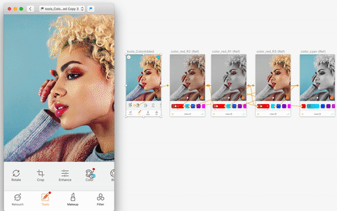
Figure 7: Interactive prototype of the final solution
(I used it for usability tests)
And I secretly kept all the complexity away from users - the sub-colors inside a color are actually different tolerance options of the color.
It worked out pretty well :)