
Color Fever & Anime Paint
Color Fever: App Store 4.8 ★★★★★ (975 ratings), ARPDAU 0.09
Anime Paint: App Store 4.8 ★★★★★ (632 ratings), ARPDAU 0.12
I joined the team at DragonPlus in March 2019 as a founding member. As the sole designer at the team, I take full responsibility of designing our products, I create designs to both meet user needs and achieve business goals. We released e coloring apps Color Fever and Anime Paint, and Home Coloring.

Provisional Personas
Since we were creating a product from scratch, I wanted to understand who our customer is, in order to make sure I am designing for the right people, and the product and UX we’re building is wanted by these customers. However, we’re a small startup and could not afford all the work and budget required for rigorous personas, so I found it would be faster and cheaper to make provisional personas, and also helpful to align the team and help communication. We “stalked” users of our own or of competitors and had sessions talking about what we think the customers were like, and put together a few personas that we later worked on validating them.
One of the provisional persona I made

The Feed
I learned the first bit of what’s designing for a hybrid gaming experience different from designing traditional digital products that solve problems. Users browse images and choose what they like to color in feed. We had three major iterations
-
1st version: a Tinder or magazine-styled design which should just bring the right image in front the user
-
2nd version: a library browsing experience, users look at the category and then scroll horizontally in that category to find the right image
-
3rd version: a curated For You feed with all images (starts with new images) and marketing banners, categorized feed can be browsed with a category tab bar
From left to right: 1st version, 2nd version and current version


I conducted user testing sessions and small interviews, along with the analytics we gathered after putting out these designs, we then gradually realized that most users enjoy having a bunch of images in front of them, so they can browse and just pick whatever they like, and also people don’t usually have a specific category in mind when opening the app — they just want to look at the images and make the choices, just like shopping at a mall.
The Core Coloring Experience
The coloring experience is the core part of a digital coloring-book product, so I wanted it to be simple but still enjoyable (cuz people color to relax, not to complete a task fast).
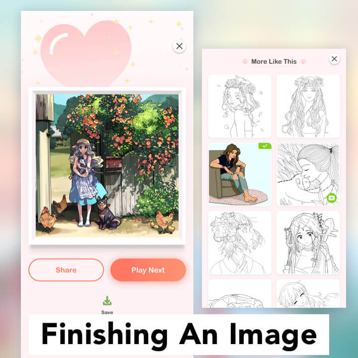
From left to right: finishing a number, finishing an image
The Feedback
Feedback plays a huge role in the coloring experience, user needs to know if an area is colored when he taps on it, he might want to know if a number is finished or not — he might be even happier if we celebrate with him when he completed an image after spending time coloring it. Thinking about these moments that we could communicate with them, I created indicators (highlighted areas of current number), feedback animations (the checkmark animation when a number is done), and transitions and celebrations to communicate with the users, as well as celebrate with them.
From left to right: entering game, using hint, hint refill
The Tools & Rewards
I wanted the tools to be helpful to users, and in the meantime beneficial to the business. So I gave them some characters. For example, the hint tool has some bounce and blinking animation when user first enters the game, just to let the user know, hey I’m here, feel free to ask for help when you need me. When the user is stuck, some extra hints slide in from the side with a timer — to give user option to get this reward for help, as well as serving monetization requirements.


